CSS Layouts
Organizing Content
© We Can Code IT, LLC
CSS Layouts
We can use CSS to not only style our code and highlight certain elements, but also to make layouts that help our users interact with our content in meaningful ways. Lets take a look at Some HTML content that we are going to give some direction to with a hierarchal layout.
Please clone this repo and follow along
Style Without Layout
So we have a page that has some default style which helps us to group some of the information together. This still feels difficult to absorb looking at it though. Let's start adding some structure to the page by building a layout.
Default Styles
The first thing we want to do is remove some default styles we're seeing from the browser. There is a lot of extra space around our elements that we want to be in control of including. So the first set of rules we are going to include are going to be a small reset so we can get rid of these styles.
/* layout.css */
* {
  box-sizing: border-box;
  margin: 0;
  padding: 0;
}
Let's explore these rules:
- The asterisk (*) tells your CSS that we want to target every element on the page
box-sizing: border-boxis telling the browser how to treat the box modelmargin: 0is telling the browser to get rid of any inherent marginpadding: 0is telling the browser to get rid of any inherent padding
Container
The next issue to deal with is our content flowing from one end of the window to the other. Let's get some space between our content and the window and move it to the center.
.container {
  margin: 0 auto;
  width: 1000px;
}
margin: 0 autois centering everything inside of thedivwith the classcontainerwidth: 1000pxis giving the container a width of1000px
Notice that the image is extending outside of the container. We'll deal with this shortly.
Header
The first element we come to in our layout is the header. We want the logo to be on the left and the navigation on the right.
header h1 {
  float: left;
}
header nav {
  float: right;
}
float: leftis making theh1element float to the leftfloat: rightis making thenavelement float to the right
Where did the header go??
Clearfix
So we can see the content of our header but the header element itself seems to have disappeared. That's because of our floats. When you float an element, it takes it out of the flow of the page. So your browser is essentially seeing a header element with nothing inside of it. If you use your inspector, you can see that the element still exists, it just doesn't have a height. What we need to do is apply what is known as a clearfix to our header. Let's make this it's own class and then apply that class to the header.
.clearfix::after {
  clear: both;
  content: "";
  display: block;
}
Now our elements are where we want them and we have our header back.
Header Content
Now we need to add some space around the header content to keep it off of the edges as well as line our navigation items up horizontally.
header h1 {
  float: left;
  padding-left: 1rem;
}
header nav {
  float: right;
  padding-right: 1rem;
}
header nav ul li {
  display: inline-block;
  margin-left: 0.5rem;
  margin-top: 0.75rem;
}
padding-{left,right}: 1remis applying space inside of each element to push it from the edge of the containerdisplay: inline-blockis arranging thelielements horizontallymargin-{left,top}is applying space outside of thelielements on the left and top
Now our elements are where we want them and we have our header back.
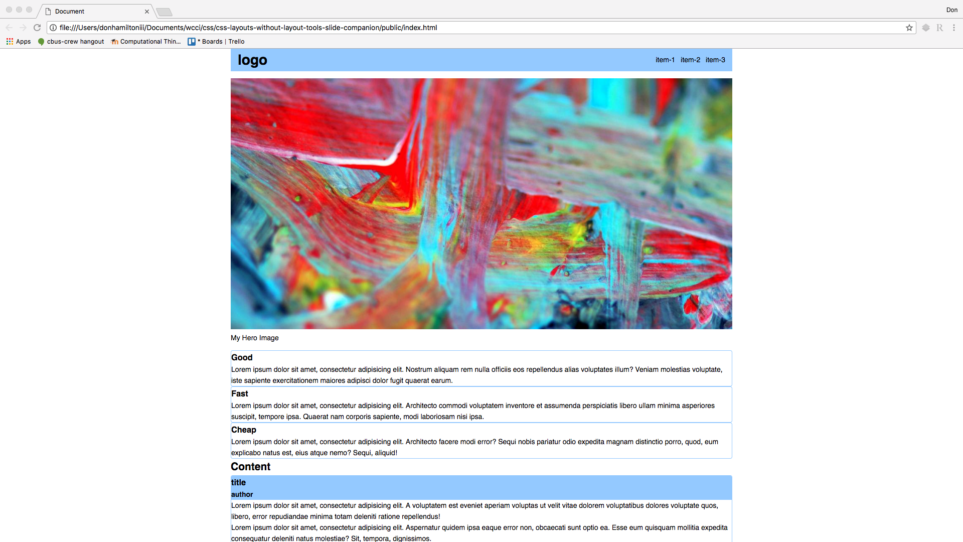
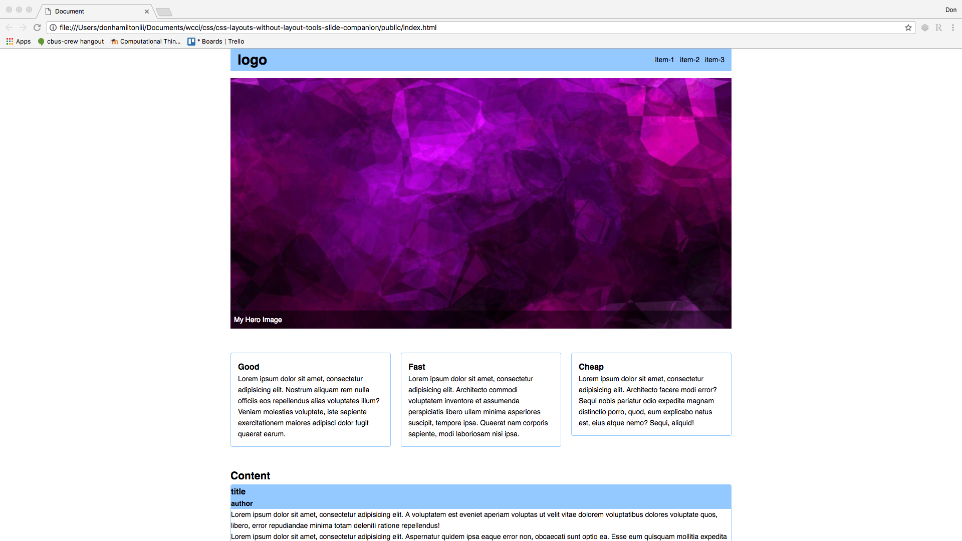
Hero Image
The next element we come to on our page is what is known as the hero image. We want to contain the image inside of our containing element, give it some space above and below it, and have the caption overlap the image. Let's start with the first two:
figure {
  margin: 1rem 0;
}
figure img {
  width: 100%;
}
width: 100%is giving the image a width of 100% relative to its containing element.
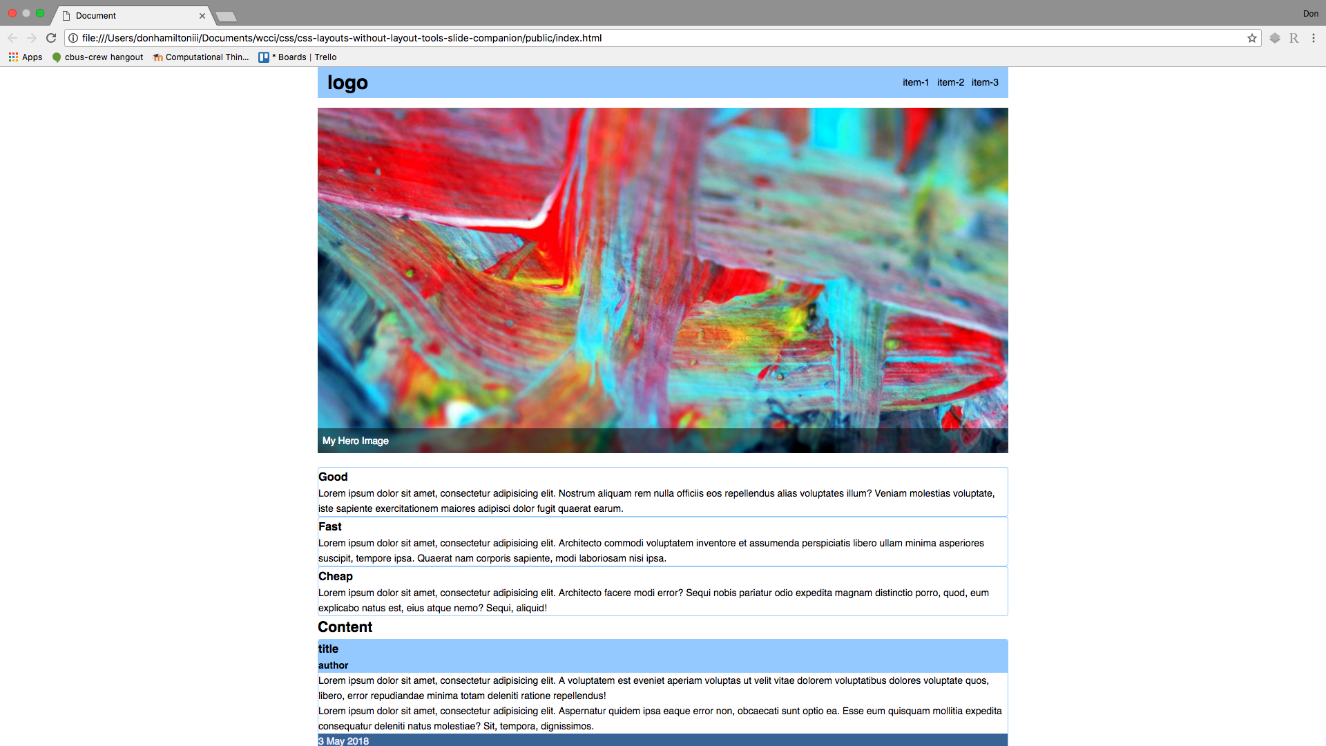
Caption
Now let's get that caption on the bottom of the image. We're going to add some code to layout as well as style here.
/* layout.css */
figure {
  position: relative;
}
figure figcaption {
  bottom: 0.4rem;
  padding: 0.5rem;
  position: absolute;
  width: 100%;
}
/* style.css */
figure figcaption {
  background-color: rgba(0, 0, 0, 0.5);
  color: #fff;
}
positionis dictating how the position of the element should be handled. The default isstaticbottomis assigning a distance from the bottom of the parent element
Highlights
Now that we have our hero image and caption set up, let's get our highlight cards set up. We want them to be lined up horizontally in three equal columns. (Don't forget to add the clearfix class to the .highlights container)
.highlights {
  margin: 3rem 0;
}
.highlights article {
  float: left;
  margin-right: 2%;
  padding: 1rem;
  width: 32%;
}
.highlights article:last-child {
  margin-right: 0;
}
So we're giving each element a width of 32% and putting 2% space to the right of each article inside of the .highlights container. We are removing the margin on the last article though, because we don't need any space between that element and it's container.
Content
Next on our list is to split the content cards into two columns. We are going to use the same strategy that we used in the previous section but with different values:
.posts {
  margin: 3rem 0;
}
.post {
  float: left;
  margin: 2%;
  width: 49%;
}
.post:last-child {
  margin-right: 0;
}
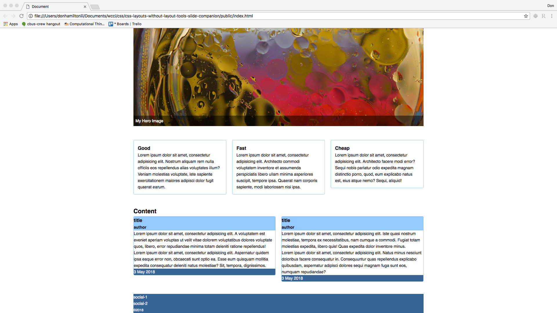
Content Cards
I don't like how the content cards have their content stuck right against the edges of the containers. Let's remedy that.
.post header,
.post .content,
.post footer {
  padding: 1rem;
}
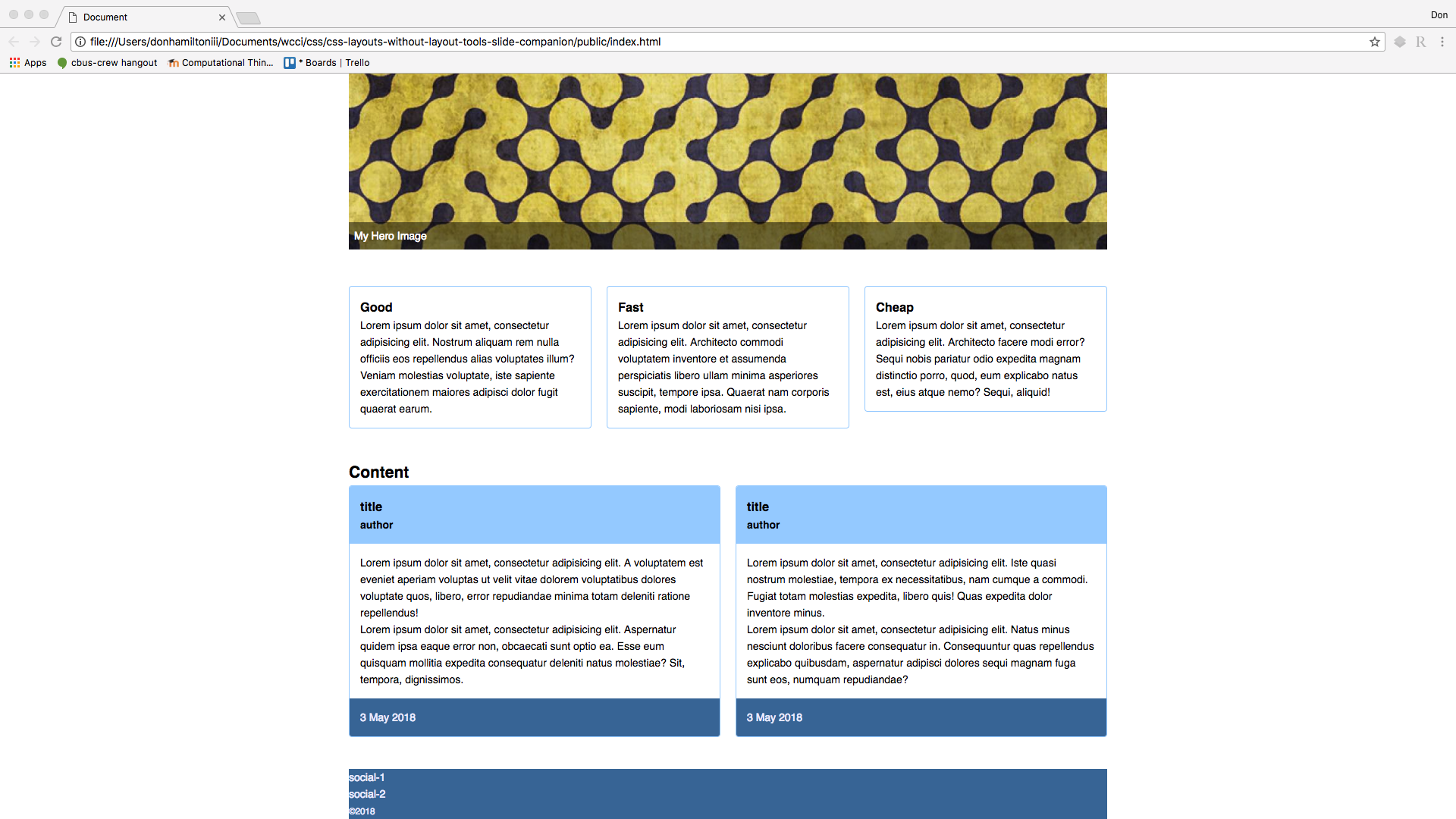
Footer
Here we are at the end! All we have left is to put the social links in the center of footer and arrange them horizontally. Then we want to center the copyright underneath of that. Finally, we want some space around all of the elements.
footer {
  padding: 1rem;
}
footer nav ul {
  text-align: center;
}
footer nav ul li {
  display: inline-block;
  margin-left: 0.5rem;
}
footer small {
  display: block;
  margin-top: 2rem;
  text-align: center;
}
text-align: center is centering everything inside of a block level element
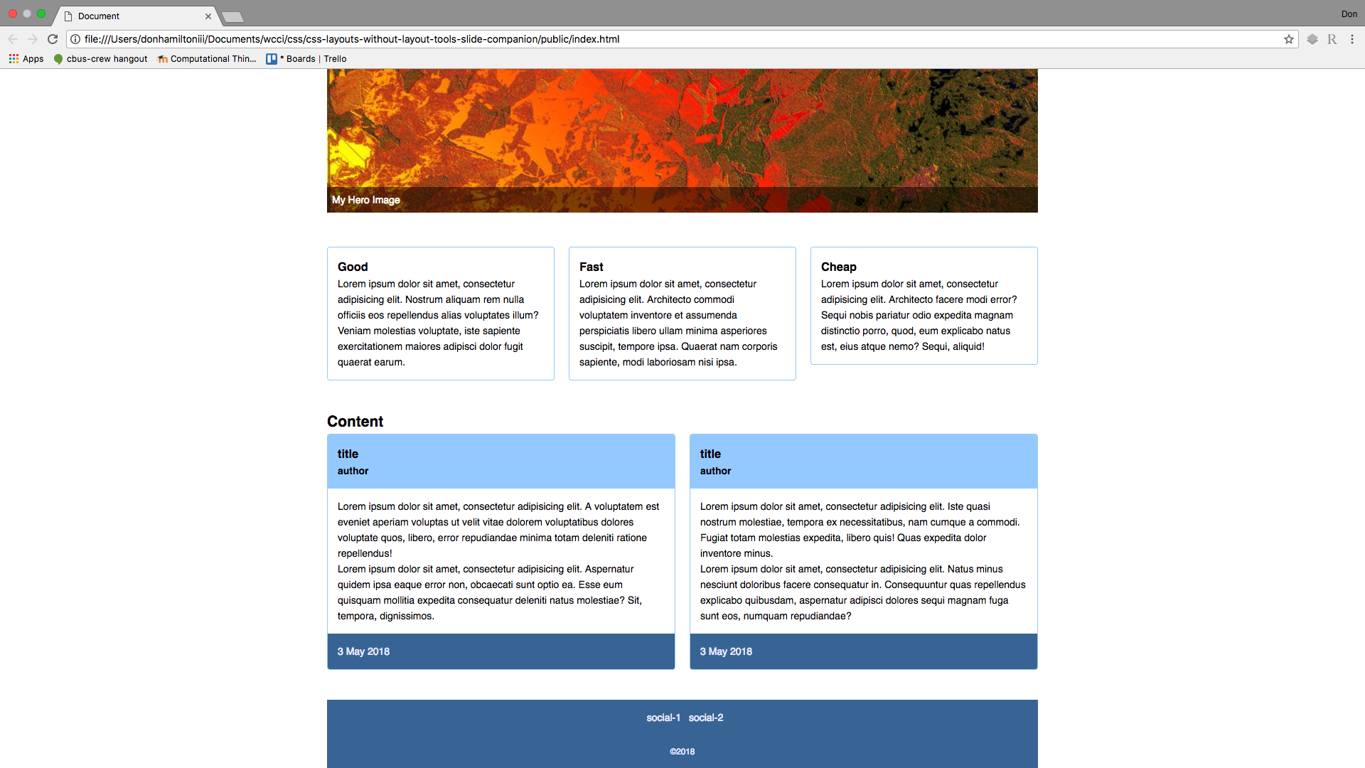
Conclusion
And there we have it! We hav a whole page, not only styled nicely, but also laid out in a way that is intuitive and organized for our users!